Creating a climate map with GPS coordinate points
Published:
This R code shows you how to plot a map for a desired country or geographic region, and how to display a chosen climatic variable (e.g. mean annual temperature, annual precipitation) as an overlay. The WorldClim dataset has 19 variables to choose from.
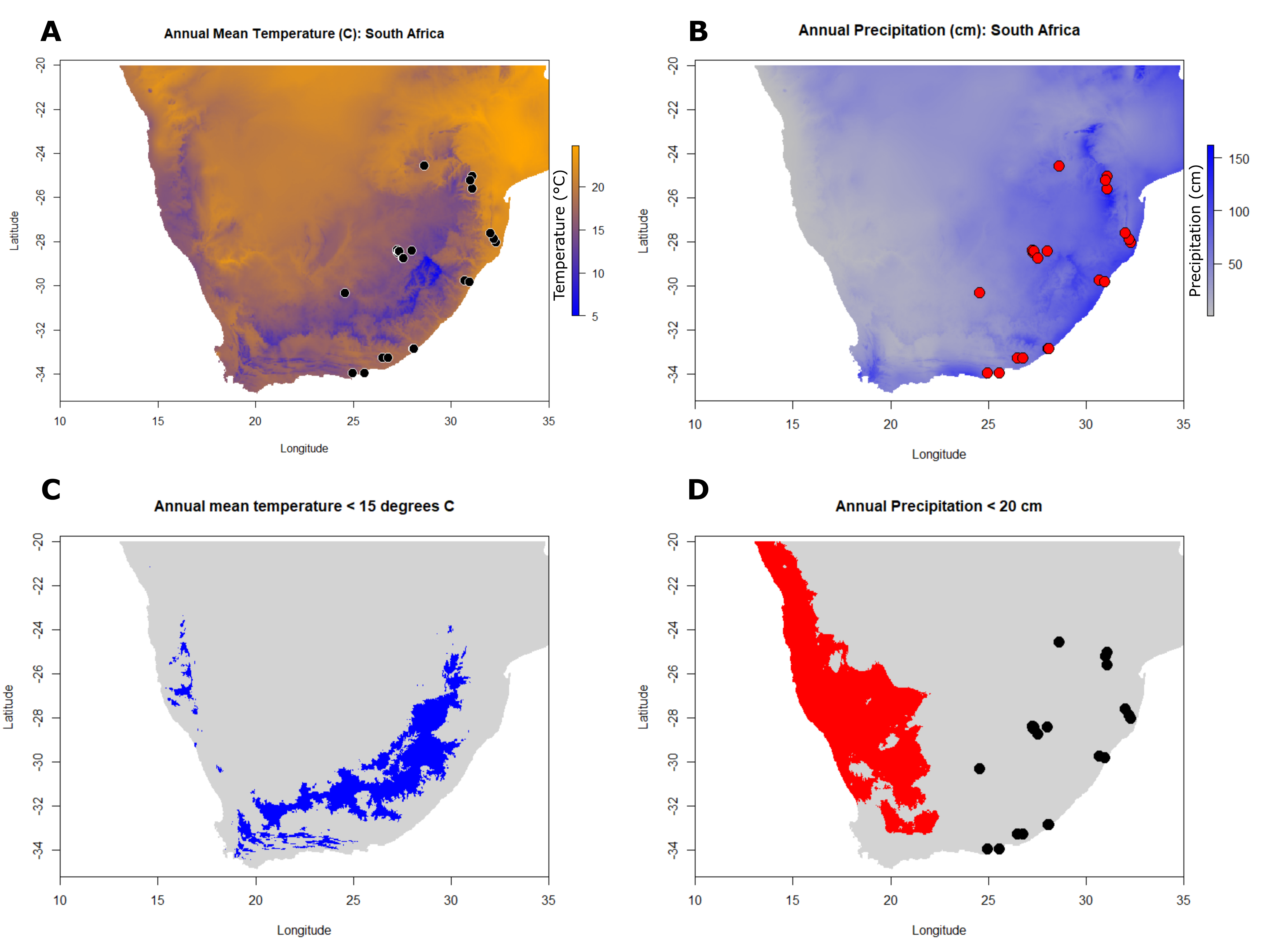
The code below produces Figures A - D, where figures A and B show how to plot a map of South Africa, with average annual temperature and precipitation layered onto it. Some GPS coordinate points are added, just to show you how to add desired sampling sites if desired. Figures C and D show how you can filter the data, so that you only display regions that meet certain constraints. For example, perhaps you want to show only those areas where the mean annual temperature was less than 15 degrees Celsius, or areas where annual precipitation was less than 20 cm.
See the final maps at the end of this post 🗺️.
library(raster)
library(ggplot2)
library(janitor)
library(dplyr)

################################################
# Import GPS points from excel file on GitHub
################################################

sample_gps = readxl::read_xlsx("G:/My Drive/Tetramesa Project/Source Modifiers/source_modifiers_updated_10_06_2021.xlsx", sheet = "Tetramesa_Clarke")

# Apply some filtering specific to this datasheet
sample_gps = filter(sample_gps, mitochondrial_COI == "TRUE" | nuclear_28S == "TRUE")

# Check data import
head(sample_gps)

# Clean the column names
sample_gps <- sample_gps %>%
  janitor::clean_names()

head(sample_gps)

################################################
# Access data from the WorldClim data set
################################################

climate = getData("worldclim", var="bio", res=2.5)

# Convert temperature metadata to degrees C, and precipitation from mm to cm
gain(climate)=0.1

# Plot a few maps to explore the data
plot(climate$bio1, main="Annual Mean Temperature")
plot(climate$bio5, main="Max Temperature of Warmest Month")
plot(climate$bio6, main="Min Temperature of Coldest Month")
plot(climate$bio3, main="Isothermality")

# Crop the world map to include just South Africa, and extract the mean annual temperature data ($bio1)
r1 <- crop(climate$bio1, extent(10,35,-35,-20))

# Extract the annual precipitation data ($bio12)
r2 = crop(climate$bio12, extent(10,35,-35,-20))

################################################################
# FIGURE A
################################################################

# Plot the mean annual temperature for South Africa
plot(r1,
     col = rev( colorRampPalette(c("orange", "blue"))( 255 ) ),
     main="Annual Mean Temperature (C): South Africa",
     xlab = "Longitude",
     ylab = "Latitude"
     )

# Add GPS coordinates
points(sample_gps$longitude, sample_gps$latitude, bg = "black", col = "white", pch = 21, cex = 2)

################################################################
# FIGURE B
################################################################

# Plot annual precipitation for South Africa
plot(r2,
     col = rev( colorRampPalette(c("blue", "grey"))( 255 ) ),
     main="Annual Precipitation (cm): South Africa",
     xlab = "Longitude",
     ylab = "Latitude"
)

# Add GPS coordinates
points(sample_gps$longitude, sample_gps$latitude, bg = "red", col = "black", pch = 21, cex = 2)

################################################################
# Experiment with filtering the data
################################################################

# Find the range of the mean annual temperatures
cellStats(r1,range)

# Find the range of annual precipitation
cellStats(r2,range)

# Select all the data where temperature is less than 15 degrees Celsius
range.temp = r1 < 15

# Select all the data where precipitation is less than 20 cm
range.ppt = r2 < 20

################################################################
# FIGURE C
################################################################

# Plot the filtered map: temp
plot(range.temp, legend = F, col = c("lightgrey", "blue"),
     main = "Annual mean temperature < 15 degrees C")

################################################################
# FIGURE D
################################################################

# Plot the filtered map: ppt
plot(range.ppt, legend = F, col = c("lightgrey", "red"),
     main = "Annual Precipitation < 20 cm")

# add some GPS points
points(sample_gps$longitude, sample_gps$latitude, bg = "black", col = "black", pch = 21, cex = 2)